


I worked with Verizon in the creation of a UI Motion Toolkit from scratch for their apps environment. This includes, concepts, UX animation, video compositing, storyboards, etc.
What We have vs What we Want
After making analysis of their actual Apps was evident the need of an intervention in a substancial way throughout the app.
How animation will work in the apps?. How animation could be organic and natural. How to make it reflect the real world in which the user actually lives?
Mood board
First of all, I made a mood board in which I place different components, movements, animations that were related to what I wanted to express in my UI animations.
After some meetings I was ready to move forward. Next thing was to start defining some basic principles.
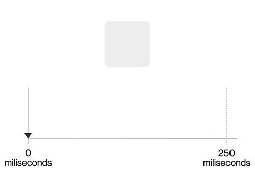
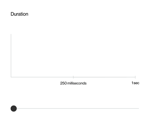
The time an animation take from start to finish has two characteristics. It could be in Real Time or Asynchronous.
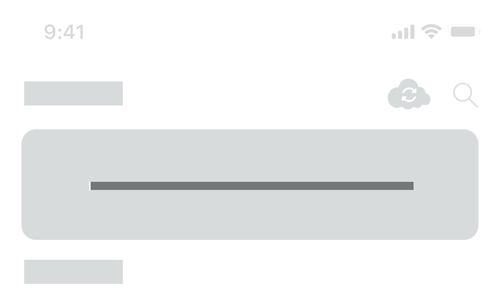
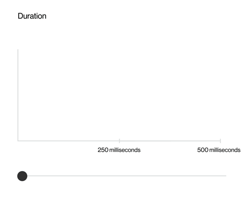
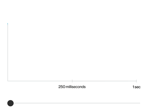
Real time is When the user directly interacts with UI objects. This time length should be 250 milliseconds.
Asincrónico Object behavior that responds to the user’s actions and transitions to the app’s response. This time length should be between 250 to 500 milliseconds.
The important thing here is not let the animation exceed 500 milliseconds to avoid user wait times.
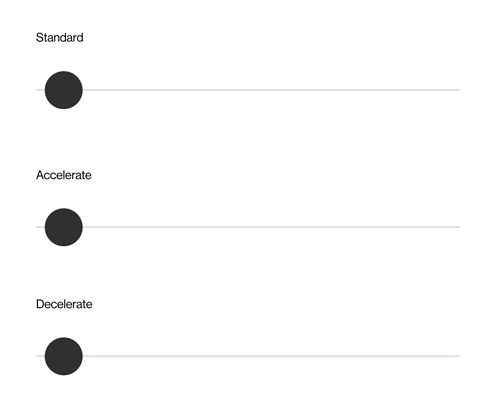
Easing provides the animation with meaning and intention. There’s 3 types of easing styles:
This is the by default" speed. Starts with an acceleration, then reach its peak and finally decelerate until stops.
Standard Easing in Context
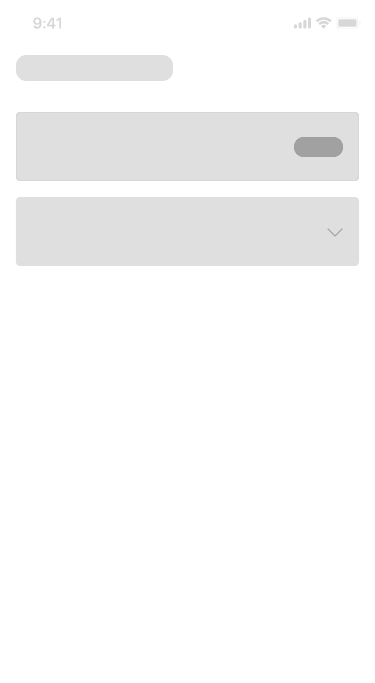
Using wireframes i tried to show this basic principles working. Standard easing could be useful in Chips or in a looped progress bar. e.g. bellow.
As their name implies, they represent the speed of an element in the interface.
Deceleration in context
Deceleration should be used when an element comes in. E.g. Below you can see two examples. The first one when a Bottom nav comes up, second one, when a menu expands.
Acceleration in context
Acceleration is mostly used when an element comes out from the screen or when the user close a modal. Some examples below.
Feedback happens when response to an user interaction.
Transormation makes the UI more organic and natural.
Transform in context
Transformations guide the user through the app. It’s very useful when a shape changes. For example when a user taps on the “Stories section” in a given app, please use a transformation animation instead of a stiff and linear animation. Transformation gives context to the UI.
Using them as info placeholders while loading screens or help users focus on progress instead of wait times.
Users need a visual guide into their journey inside the app. This is very useful when change screens or when a modal comes in. I used a smooth curve in the animation to show to the user the direction from the object comes.
By definition, Fade is a gradual appearance of an image. For this app I proposed Using a fade-in of elements from top to bottom with a slight delay.
Those concepts presented above were the roots of the UX Motion Toolkit for the Verizon App environment and a reference for developers as well.